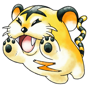
We sat down with artist Rachel Briggs, the artist responsible for the Ken Sugimori style artwork of unused Pokémon from the 1997 Spaceworld demo of Pokémon Gold, recently seen in Game Informer, to talk about her process, inspirations, her fascination with the subgenre, and monster designs in general.
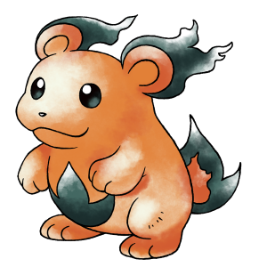
What inspired you to create this artwork, was it just for fun or did you feel like it was something you had to put upon yourself to do?
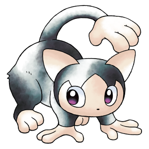
“When I was first shown the sprite for Honoguma, I was struck by how different it looked from the original fan art interpretation we had previously known. I really wanted to accurately recreate what it could have looked like if Ken Sugimori had drawn it. The more of these lost designs that I got to see, the more excited I was, and I really wanted them all to get the treatment I felt they deserved.”
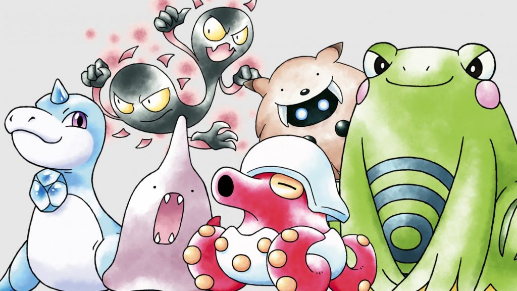
When you first started creating the artwork, did you think it would end up in a Game Informer article, and how did you find that opportunity?
“I had originally hoped to get to draw all of the cut or changed Spaceworld designs before the demo got publicly released, so that they could be shared alongside it to build hype, but the demo ended up leaking before that could happen. I still wanted to draw all of them though, so I figure it could still be a nice bonus to go out alongside the translation and bugfix patch by Team Spaceworld. I had also decided early on that if any publications wanted any images to use for illustrative purposes besides the sprite rips, they could use my “pseudomori” art. So, when Game Informer interviewed obskyr (Samuel Messner), he gave them some of my art to use.”
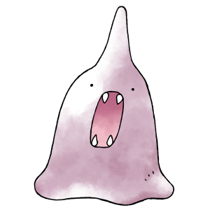
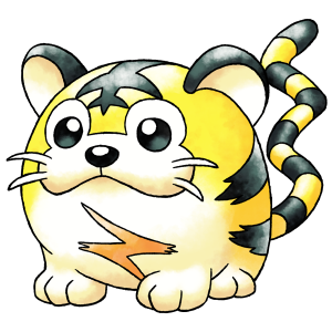
Which of the Spaceworld demo Pokémon are your favorite and why?
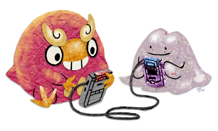
“My all-time favorite Pokémon is Ditto, and when I heard it actually got an evolution I really didn’t know what to expect – but it certainly wasn’t a screaming ice cream with fangs! I can see why they cut it, but I really love Animon (also known as Lykewyse) for how bizarre and impractical it is. My actual favorite Spaceworld design, which instantly rocketed up to one of my top favorite overall Pokémon, is definitely Kotora. It looks like a caricature of my fat orange tabby, Bit, and its sprite is just the most precious thing ever pixelated. My heartbreak at learning that it existed only to have been cut was compounded once research from Helix Chamber revealed that Kotora (and its evolution Raitora) had also been cut from the first generation games!”
Besides Ken Sugimori, who are some of your other inspirations?
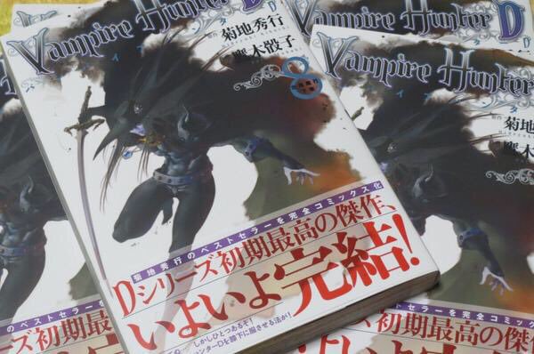
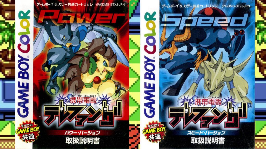
“Mostly, nature in general – I was always fascinated with animal biology and anatomy as a kid; I pored over tons of illustrated encyclopedias about birds, dinosaurs, mammals, etc. I was also extremely interested in mythological creatures, especially chimeric ones like dragons and griffins which combine features of real-world animals. It’s probably not a surprise that I fell in love with Sugimori’s original watercolor artwork for Pokémon! I’m also a huge fan of Saiko Takaki, a freelance artist who designed and illustrated all of the 300+ Denjuu for Keitai Denjuu Telefang, as well as the series logo. She’s also known as being the illustrator for the Vampire Hunter D manga. Besides digital illustration, she also works in other mediums like sculpture, jewelry, and so on. She’s just fantastically cool.”
So you’re known to be a big fan of Telefang, can you tell us more about your fascination with that?
“I first read about “Pokémon Diamond & Jade” back around 2001 or so. They were being discussed on a Pokémon fansite as possible new Pokémon games, but I recognized that they were clearly rom hacks of something else and became extremely curious about their origins. There was actually very little information available online about the real games, so around 2005 I sort of took it upon myself to compile as much data as I could, and drew a bunch of fan art so other people could appreciate the unique monster designs.
In 2007, another fan named Blaziken257 was inspired to create the Tulunk Village forums, which became a hub for the growing Telefang fan community. Over the years, it’s attracted an extremely talented group of people not only interested in mon games as a genre, but also translation, coding, and game preservation. The largest ongoing project we have is a professional-level English translation patch for the original Telefang games. One guy who joined to help us as a translator, DaVince21, even ended up marrying my sister. It might not be surprising to learn that Sanqui and obskyr of Team Spaceworld also came from the very excellent Tulunk community!”
Are they any specific Pokémon designs or other monster designs that you just really don’t like? As in you would redesign them or erase them out of existence if you had the ability?
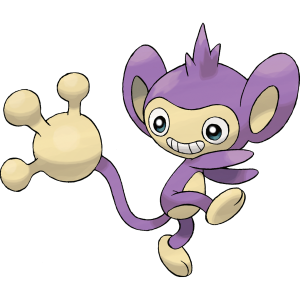
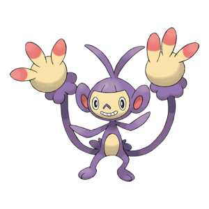
“I usually try to avoid talking about which designs I personally dislike, because every single Pokémon is somebody’s favorite, and I wouldn’t go so far as to erase any, but… Aipom is really creepy, and Ambipom is even worse. It doesn’t help matters that now we know from Spaceworld that the original Aipom design was actually pretty cute! I really don’t like Volbeat and Illumise either, I think both of their designs would be improved by at least removing their noses. I vastly prefer bugs that don’t look like weird gnomes.” 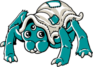
Upcoming monster RPG Monster Crown features a few user submitted designs, were you responsible for any, and if so, which?
“When I first heard of Monster Crown I was instantly hooked, and I’ve been pretty excited to watch it progress. It’s a very unique mongame which clearly draws inspiration from a specific sort of nostalgia for when the unknown elements of games were super mysterious and even a bit creepy, a feeling I haven’t really seen anybody else try to capture.
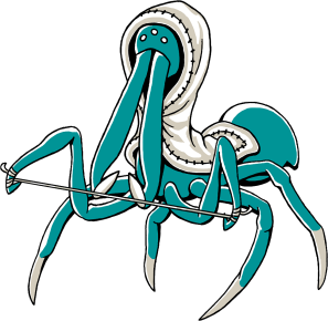
Anyway – during the Kickstarter campaign, a friend of mine from the Telefang community, andwhyisit, generously backed for the monster design tier and gave me free reign of the design! I thought for a while on what I would most want to see, and ended up designing Nighknit, a cute fluffy spider who carries a silk blanket on its back. I also designed one of Nighknit’s hybrid forms, a much creepier-looking vicious version based on assassin spiders who now wears its blanket like a hood.
I’ve also been given the unbelievable opportunity to design one of the hybrid forms for a monster submitted by Saiko Takaki herself! I’m really, really looking forward to working on that one”
What is the most important piece of advice you could give to aspiring artists and character designers?
“Don’t be afraid to get weird – think about what you thought looked cool when you were a little kid. Kids have extremely good taste in monster design! Purposefully including at least one odd detail will make a design way more memorable. It also helps to build a large mental reference library of interesting animal traits to borrow for creature designs.”
Can we expect more Pokémon art from you in the future, and what have you been currently working on?
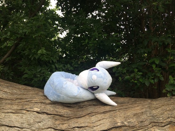
“Oh, definitely, I will never stop drawing Pokémon! A lot of what I’ve been working on recently is stuff for Pokéthon, a really spectacular charity gaming marathon. Lately, I’ve also been trying to level up my plush-making skills, for example, I recently finished a life-sized 6 foot long Dratini. I would really like to make some plush Spaceworld Pokémon, they really deserve to exist in a huggable form.”
You can see more of Rachel’s “pseudomori” Pokémon artwork on Bogleech Pokémon Reviews. You can also check out her other artwork on DeviantArt, and can support her through her Etsy and Redbubble pages. Additionally, Monster Crown is set to launch in February 2019 for PC, Nintendo Switch, PlayStation Vita, and Android.


